Tourism products

Explore an unlimited galaxy
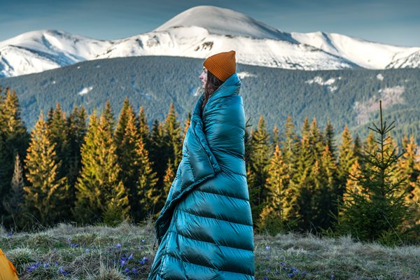
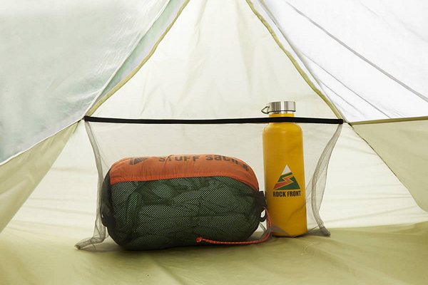
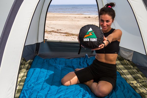
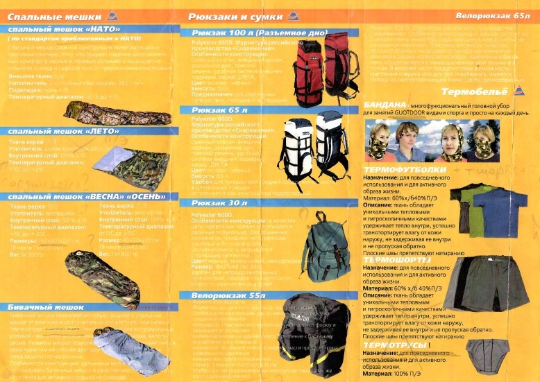
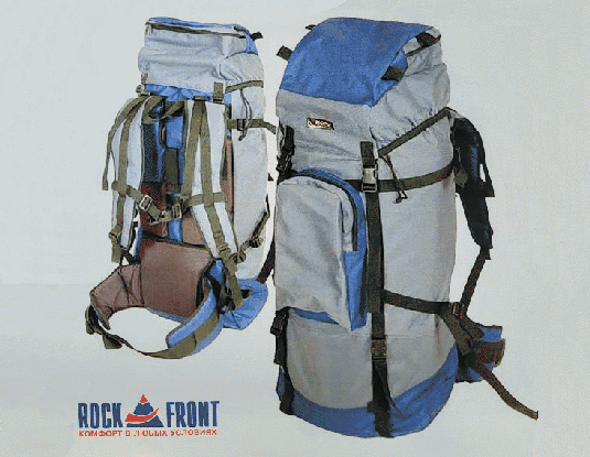
In 1999, a line of tourist products called ROCK FRONT was launched. Under this brand, the company began manufacturing tourist backpacks, sleeping bags, thermal underwear, and bicycle bags. At that time, they began working with advanced materials such as Hydrocoat membrane fabrics and VelaFlex insulation.
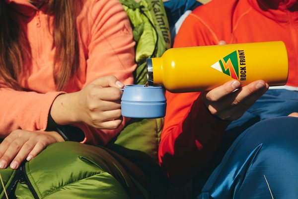
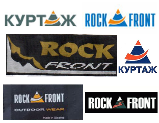
The ROCK FRONT logo is an image of a rocky mountain in the form of a green triangle with a white snow-covered peak, through which a zigzag element passes, symbolizing the path to the top. In earlier versions of the logo, instead of this, there is an arch-shaped element, as in the inscription “Courtage.”

Slogan
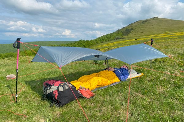
The company’s first slogan, “Comfort in all conditions,” became the brand’s philosophy: a balance between lightness, reliability, and maximum ease of use. Over time, it was modified to a simple expression: “Smart ultralight” — that is, lightweight equipment without extreme asceticism.
The origin of the name
The name ROCK FRONT was suggested by Sergey Zarubin, who was the first head of the tourism department, as it sounds good, is easy to remember, and at the same time conveys the desire to achieve lofty goals.
Thoughtful solutions and simple design
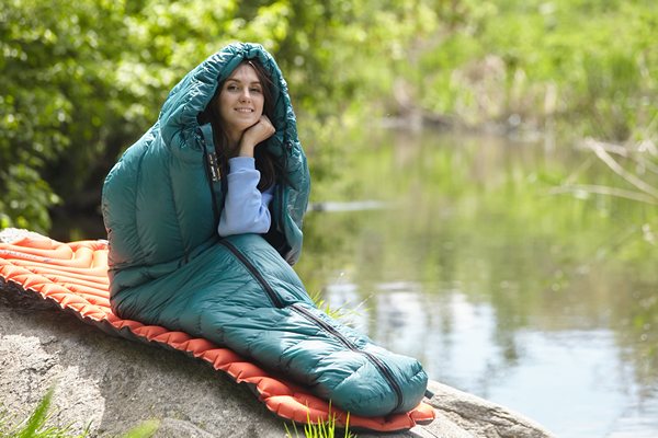
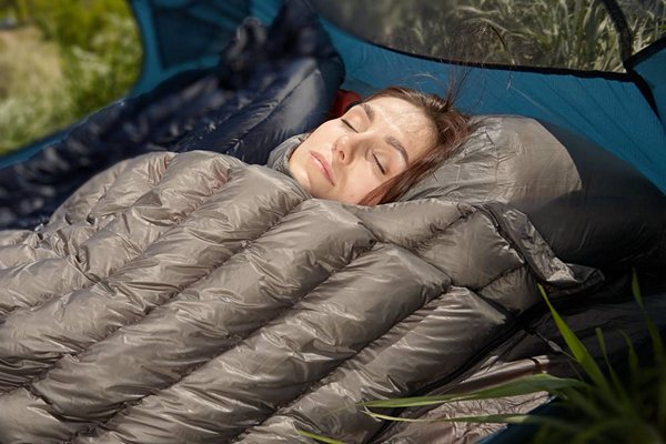
The first items featured many innovations: sleeping bags with a central zipper that could be converted into a regular quilt, connected to another sleeping bag, or used to insulate a hammock. Later, a different vision of the quilt emerged, transforming it from equipment into a comfortable sleeping system with a sheet.